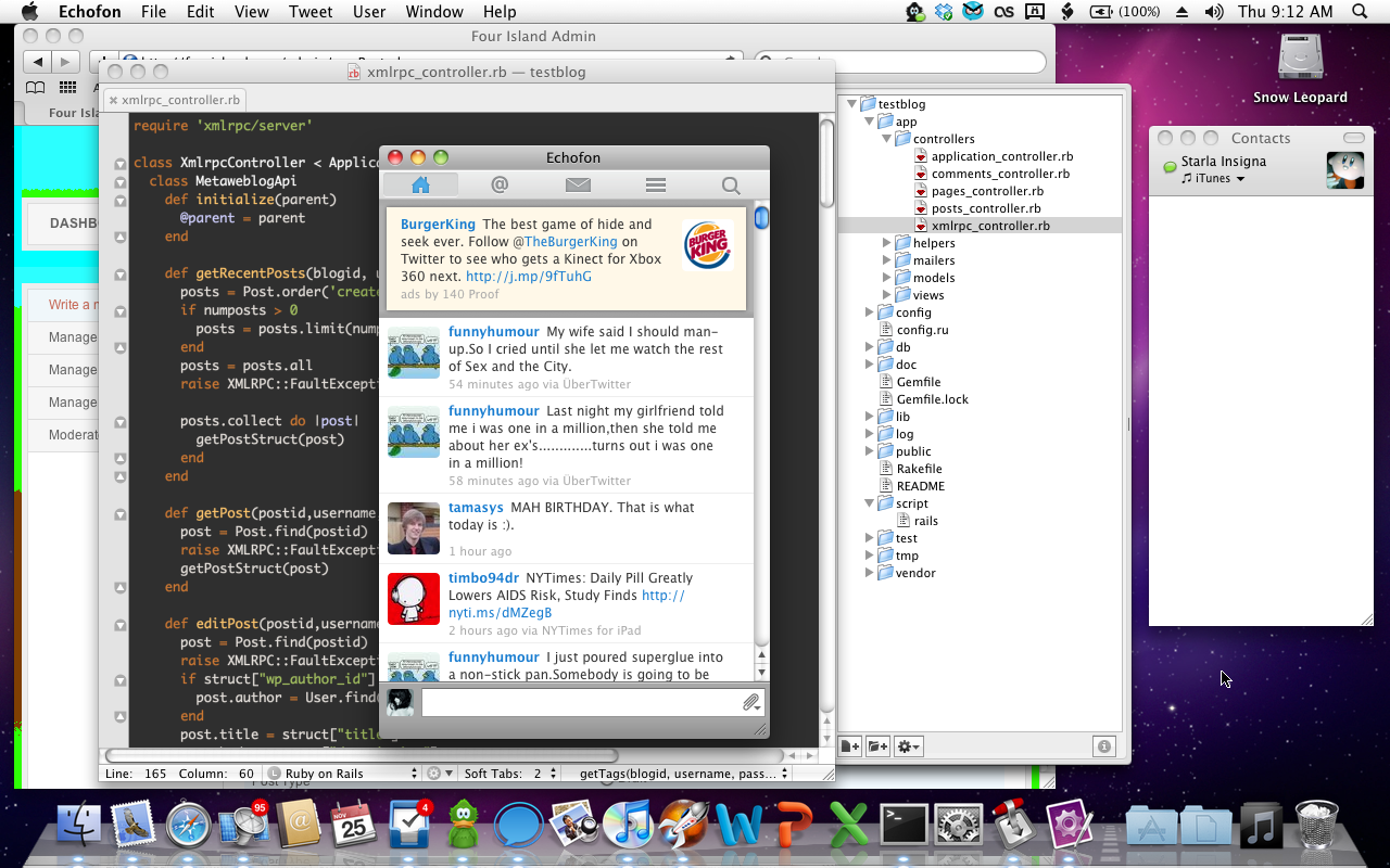
onI know, I know, it may not be the best of titles as one of OS X's most criticized elements is how bad it is at window management, but hear me out. Okay, so Snow Leopard has been the latest version of Mac OS X for quite a while now and it's the OS X I fell in love with and the OS X I currently use. I really do enjoy Snow Leopard. Then, about a month ago, I sat around on October 20th, waiting to hear what Apple was going to announce because we all knew it would be a new version of Mac OS X. Yes, we were right. But, no, I was not satisfied at all with the news of Mac OS X Lion, and here I am, finally about to explain it. :P
Macs have always been criticized (quite frequently by me) as being too different, but since discovering that I love Macs, I've realized that it's not supposed to be the same as anything. And why should it? There's no reason that Mac OS X should be the same as Windows or Linux, and there's no reason it should have the same paradigms. One huge paradigm difference I've noticed between Windows and OS X is window management.
In Windows, it's not only easy to do, but it's practically expected of you that you will pretty much have your windows maximized at all times, unless you're doing something that requires you to see two windows at once. Windows is a huge fan of the MDI (Multiple Document Interface) paradigm which allows you to have one window maximized, but able to see and interact with a lot of information.
By contrast, OS X's window management paradigm is centered around SDI (Single Document Interface) windows, and a lot of them. In OS X, it's not fashionable to have a window filling your screen--you can do many things at once and the windows are all there! In fact, one of the biggest annoyances that people switching to the Mac find is that they expect the three stoplights in the top left of every window to act similarly to the window control buttons in the top right of every window in Windows, probably because they look similar. And yes, for the most part, they do act similarly, but the green stoplight does not do the same thing as the maximize button--it simply resizes the window to best fit its contents.
Now, as I'm sure you'll notice, the SDI paradigm doesn't really work out too well on my laptop with its tiny 1280x800 screen. While I totally agree with the Mac's SDI paradigm, I believe it only really works well on desktop computers because they have much larger screens. On computers like my laptop, the screen is so small that I normally have to keep certain apps' windows maximized all the time like Mail, Safari and NetNewsWire. But on desktop computers and laptops that are hooked up to larger screens (which I totally plan to do some day! :D ), SDI works fine and is so awesome.
One of OS X Lion's most touted features is the addition of full-screen modes to a whole ton of apps. This worries me. I mean, yes, I can certainly see it being handy on a laptop, but when I get my LED Cinema Display and hook my laptop up to that so I have a bigger screen, what then? I don't want full screen apps with such a large screen--I want my SDI paradigm back! The iPad is the iPad, but the Mac is the Mac--they're two completely separate things and I really don't think OS X needs to take anything from iOS.
Yes. Change is always bad. :P
No, but really, this really bothers me. I have strange dreams of having a large-screen Mac and writing a post on Four Island with MarsEdit while reading an email and surfing the web at the same time as chatting with friends and doing a little programming in TextMate. No, seriously, I'm not weird. :P
This isn't the only problem I have with OS X Lion, but it's a pretty big one. One of the other problems I have is the iOS-ization of some built-in apps, such as Mail and iCal:
Doesn't that look... just... bad? Snow Leopard stole my heart with its colorful, sleek interface and iOS just does not work like that. iOS belongs on the iPhone / iPod touch / iPad / Apple TV / WHATEVER, and Mac OS X belongs on the Mac. Let's keep it that way, shall we?
I'd like to make one last note regarding the criticism of Mac window management, specifically with regards to resizing windows. Sure, you can only resize Mac windows from one corner, and yes, that is fairly annoying, but it's not too bad. On the other hand, Windows programs, when not maximized, have a hideous border around them that allows you to resize in any direction. No. Just.... no. There is no real middle point, though, because GNOME on Linux allows resizing from any direction without a hideous border and it's just impossible to resize a window without either clicking through to the background or clicking in the window. Yay for Macs.
Finally, I'd like to say: Happy Thanksgiving and Happy Birthday To TimTam! :P
NOV
25


Comments